
The Balance Between Form and Function: A Web Designer’s Dilemma
Posted on Mobile First | Branding | ADA Compliance | UX Design | SEO

- Functionality ensures a website works seamlessly, prioritizing usability, performance, and accessibility.
- Thoughtful design (form) enhances user experience by creating visually engaging and emotionally resonant interfaces.
- Mobile-first design prioritizes functionality on smaller screens, placing usability at the forefront.
- Lessons from architecture and design history highlight the importance of integrating purpose with aesthetics.
Estimated reading time: 6 minutes
In 1896, architect Louis Sullivan coined the phrase “form follows function,” a principle that would shape modern design thinking for decades. The idea suggests that an object’s shape or appearance should primarily relate to its intended purpose. While Sullivan’s vision emerged in architecture, the philosophy resonates with artists, designers, and creators of all mediums, including websites.
For modern website designers, the struggle between form and function is not merely theoretical; it’s a daily reality. Websites must be visually appealing, but they must also operate seamlessly across devices, load quickly, and assist users in achieving their goals. Finding the ideal balance between aesthetics and usability is an art in itself. Let’s explore how this balance can be attained and why prioritizing functionality often results in a superior final product.
Lessons from Architecture and Art
Louis Sullivan: Form Follows Function
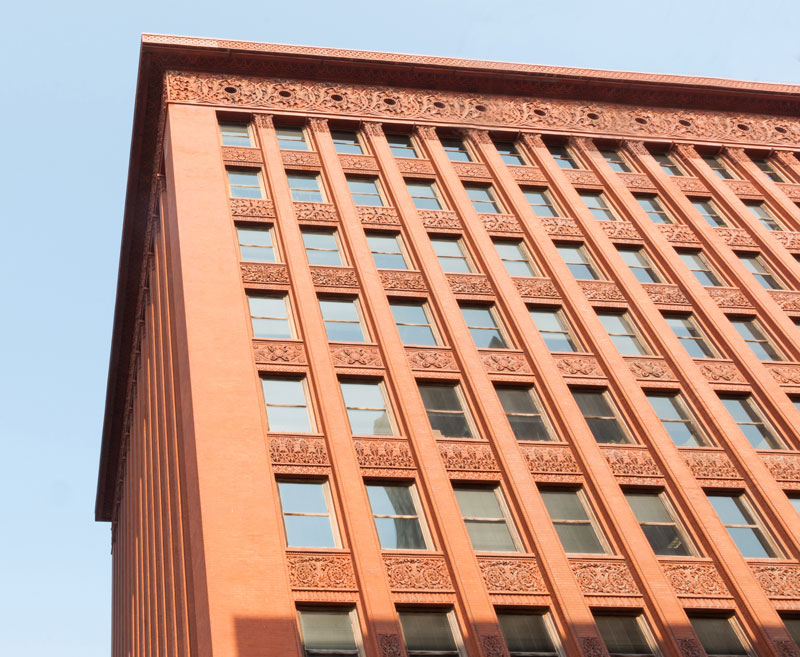
Louis Sullivan, known as the “father of skyscrapers,” argued that buildings should prioritize functionality over decorative details. His designs, such as the Wainwright Building, exhibit a minimalist elegance that highlights usability and strength.
Sullivan’s approach teaches us that design transcends mere surface-level beauty. A website may feature stunning visuals, but if it loads slowly, is hard to navigate, or is unresponsive on mobile devices, it ultimately fails in its primary function.
Artists’ Struggles with Balance
Artists have long struggled to balance aesthetics and message. Consider Vincent van Gogh, whose expressive brushstrokes and vibrant colors convey raw emotion while achieving compositional harmony. His work reminds us that beauty and meaning are not mutually exclusive; they enhance one another when thoughtfully integrated.
For websites, this involves crafting designs that are visually appealing while still meeting the user’s needs. Although overly complex layouts or excessive animations may appear impressive, they often obstruct usability, particularly on slower devices or connections.
The Functionality-First Approach: Why Function Comes First
At its core, a website’s main purpose is to provide information, resolve issues, or enable transactions. Before thinking about a site’s appearance, designers must focus on:
- Usability: Can users easily navigate the site and find what they need?
- Performance: Does the site load quickly and function smoothly?
- Accessibility: Is the site usable for people with disabilities or those using assistive technologies?
- Mobile Optimization: Does the site work seamlessly on devices of all sizes?
- Focusing on these elements ensures the website fulfills its primary purpose before offering aesthetic enhancements.
Mobile Design: A Case Study in Prioritizing Function
With mobile traffic surpassing desktop traffic in recent years, web designers have adopted a mobile-first design strategy. This approach emphasizes functionality for smaller screens, where limited space makes every pixel count.
Important factors to consider include:
- Simplified Navigation: Mobile users need intuitive menus and easy-to-use buttons.
- Readable Text: Fonts and layouts should scale appropriately to avoid forcing users to pinch and zoom.
- Fast Load Times: Mobile connections can vary, making lightweight designs essential.
- Touch-Friendly Elements: Buttons and links must be large enough to tap without frustration.
Mobile-first design often compels designers to distill their ideas to the essentials, eliminating unnecessary visual elements. This focus aligns with Sullivan’s philosophy: form follows function.
The Role of Design: Enhancing Function
Once the functional foundation is in place, thoughtful website design can elevate the user experience. Here are ways form complements function in web design:
Visual Hierarchy: A well-designed website uses a visual hierarchy to guide users through the content. The strategic arrangement of headings, images, and CTAs (calls to action) helps users understand where to focus their attention and what actions to take next. For example:
- Bold, contrasting colors can highlight key buttons like “Sign Up” or “Buy Now.”
- Larger font sizes for headlines draw attention to important messages.
- Negative space creates breathing room, making the layout easier to digest.
Branding and Emotional Connection: Design plays a vital role in conveying a brand’s personality and values. Fonts, colors, and imagery evoke emotions and foster trust, transforming visitors into loyal customers. A tech startup might employ clean lines and minimalist colors to suggest innovation, whereas an artisan bakery may favor warm tones and textured backgrounds for a cozier atmosphere.
Accessibility as a Design Choice: Accessibility illustrates how function influences form. Design elements such as high-contrast text, readable fonts, and keyboard-friendly navigation adhere to standards like the ADA and enhance the user experience for all. By integrating accessibility into the design process, you create a site that is both inclusive and user-friendly.
Avoiding Common Pitfalls
Overdesign: Some websites go too far in their quest for creativity, using flashy animations, parallax scrolling, or excessive visuals. While these elements may initially impress users, they can result in slower load times and frustrated visitors. Remember: simplicity often beats complexity.
Neglecting Content: Beautiful design can’t mask poor content. Ensure your site’s messaging is clear, concise, and valuable to your audience. Design should amplify the message, not distract from it.
Ignoring Analytics: You can’t improve what you don’t measure. Tools like Google Analytics or Hotjar can monitor user behavior and pinpoint problem areas. If users often abandon a page, this may suggest a disconnect between form and function.
Form Over Function: Flash Websites
One of the most notorious examples of prioritizing aesthetics over functionality in web design is the use of Adobe Flash. Launched in the mid-1990s, Flash enabled designers to create highly interactive and visually stunning websites that featured animations, video, and sound effects. For a time, Flash symbolized the pinnacle of cutting-edge web design.
Visionary adopted Flash early on, creating vibrant and engaging sites that pushed our clients’ design boundaries. However, like many in the industry, we encountered the challenges inherent to the technology:
- Performance Issues: Flash sites often experienced slow loading times, resulting in user frustration and increased bounce rates.
- Incompatibility: Flash required users to install a plugin, which wasn’t supported on many devices, including Apple’s iPhone and iPad.
- Accessibility Problems: Flash-based designs were difficult to navigate for users with disabilities, as they often ignored web accessibility standards.
- SEO Challenges: Search engines struggled to index Flash content, limiting a website’s discoverability.
While Flash sites seemed impressive, their poor usability and compatibility issues ultimately led to the technology’s decline. In 2020, Adobe officially ended support for Flash, solidifying its status as a cautionary tale in web design.
Achieving the Balance: The Collaboration Between Designers and Developers
The best websites result from close collaboration between designers and developers. Designers concentrate on aesthetics, while developers focus on functionality. Regular communication guarantees that both teams understand the project’s goals and constraints.
Iterative Design
Balance isn’t achieved overnight. Iterative design—testing, analyzing, and refining—helps align form and function over time. Start with a wireframe focused on functionality, then layer in design elements based on user feedback.
Balancing form and function in web design isn’t merely a technical challenge; it’s an opportunity to craft meaningful digital experiences. Like Louis Sullivan’s skyscrapers or Van Gogh’s paintings, a well-designed website combines purpose with beauty, leaving a lasting impact on users.
By prioritizing functionality, optimizing for mobile devices, and leveraging design to improve usability, you will create a website that not only looks fantastic but also performs exceptionally well. Remember, form should always support function; together, they can achieve something truly extraordinary.